Source:
vignettes/Get_started.Rmd
Get_started.Rmdggfertilizer— title: “Get started with ggfertilizer” author: “Wenlong Liu” date: “2018-07-13” output: rmarkdown::html_vignette vignette: > % % % —
Retrieve, Summarize and Visualize the Fertilizer Data in USA
Provides a user-friendly API to further dig in County-Level Fertilizer data in USA, provided by USGS.
Quick Start
Retrieve fertilizer data
Year <-  2008
Nutrient <- "N"
Input_Type <- "fertilizer"

# retrieve data.
plot_data <- get_data(data = us_fertilizer_county, years = Year, nutrient = Nutrient,
                      input_type = Input_Type,  combine_state_county = TRUE)
head(plot_data)
#> # A tibble: 6 x 12
#>   FIPS  State County       ALAND  AWATER INTPTLAT INTPTLONG Quantity Year
#>   <chr> <chr> <chr>        <dbl>   <dbl>    <dbl>     <dbl>    <dbl> <chr>
#> 1 01001 AL    Autauga,…   1.54e9  2.58e7     32.5     -86.6   783984 2008
#> 2 01003 AL    Baldwin,…   4.12e9  1.13e9     30.7     -87.7  4948455 2008
#> 3 01005 AL    Barbour,…   2.29e9  5.09e7     31.9     -85.4  1171588 2008
#> 4 01007 AL    Bibb, AL    1.61e9  9.29e6     33.0     -87.1   141669 2008
#> 5 01009 AL    Blount, …   1.67e9  1.52e7     34.0     -86.6  1206109 2008
#> 6 01011 AL    Bullock,…   1.61e9  6.06e6     32.1     -85.7   629577 2008
#> # ... with 3 more variables: Nutrient <chr>, Farm.Type <chr>,
#> #   Input.Type <chr>
Summarize and plot data.
Example 1: Find out the top 10 counties with most nitrogen appliation in 2008.
# plot the top 10 nitrogen application in year 2008.
plot <- plot_data %>%
  top_n(10, Quantity) %>%
  ggplot(aes(x=reorder(County, Quantity), Quantity, fill = Quantity))+
  scale_fill_gradient(low = "blue", high = "darkblue")+
  geom_col()+
  ggtitle(paste("Top 10 counties with most N fertilizer application in the year of", Year)) +
  scale_y_continuous(name = "Nitrogen from commecial fertilization (kg)")+
  scale_x_discrete(name = "Counties")+
  coord_flip()+
  theme_bw()
plot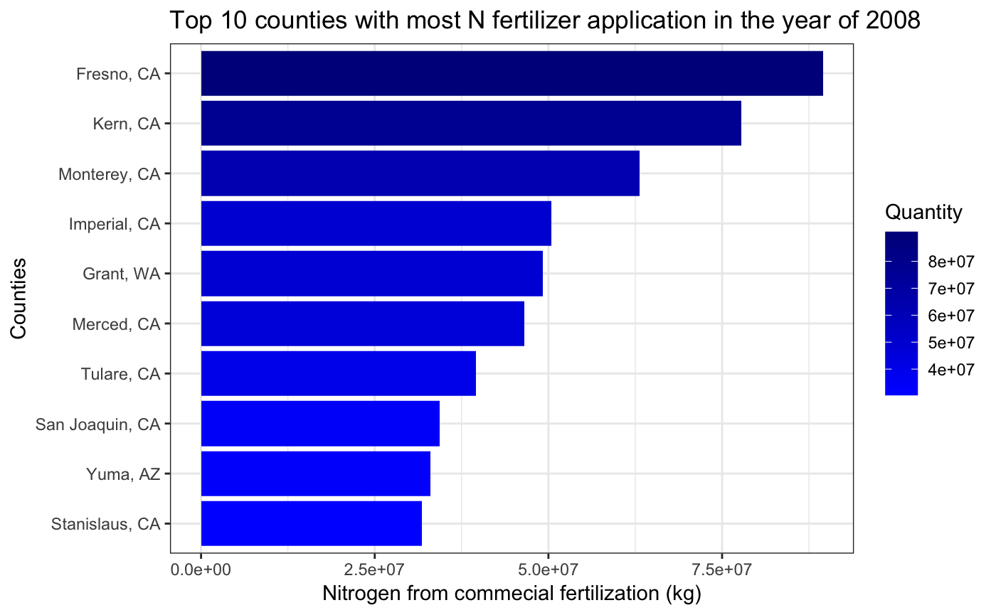
Examples 2: Visualize the fertilizer data in US maps.
Year = 2001
Nutrient = "N"
Farm_Type = "farm"
Input_Type = "fertilizer"
level  = "county"

# draw the map
us_plot <- map_us_fertilizer(data = us_fertilizer_county, Year = Year, Nutrient = Nutrient,
                             Farm_Type = Farm_Type, Input_Type = Input_Type,
                             viridis_palette = "inferno", level = level)
us_plot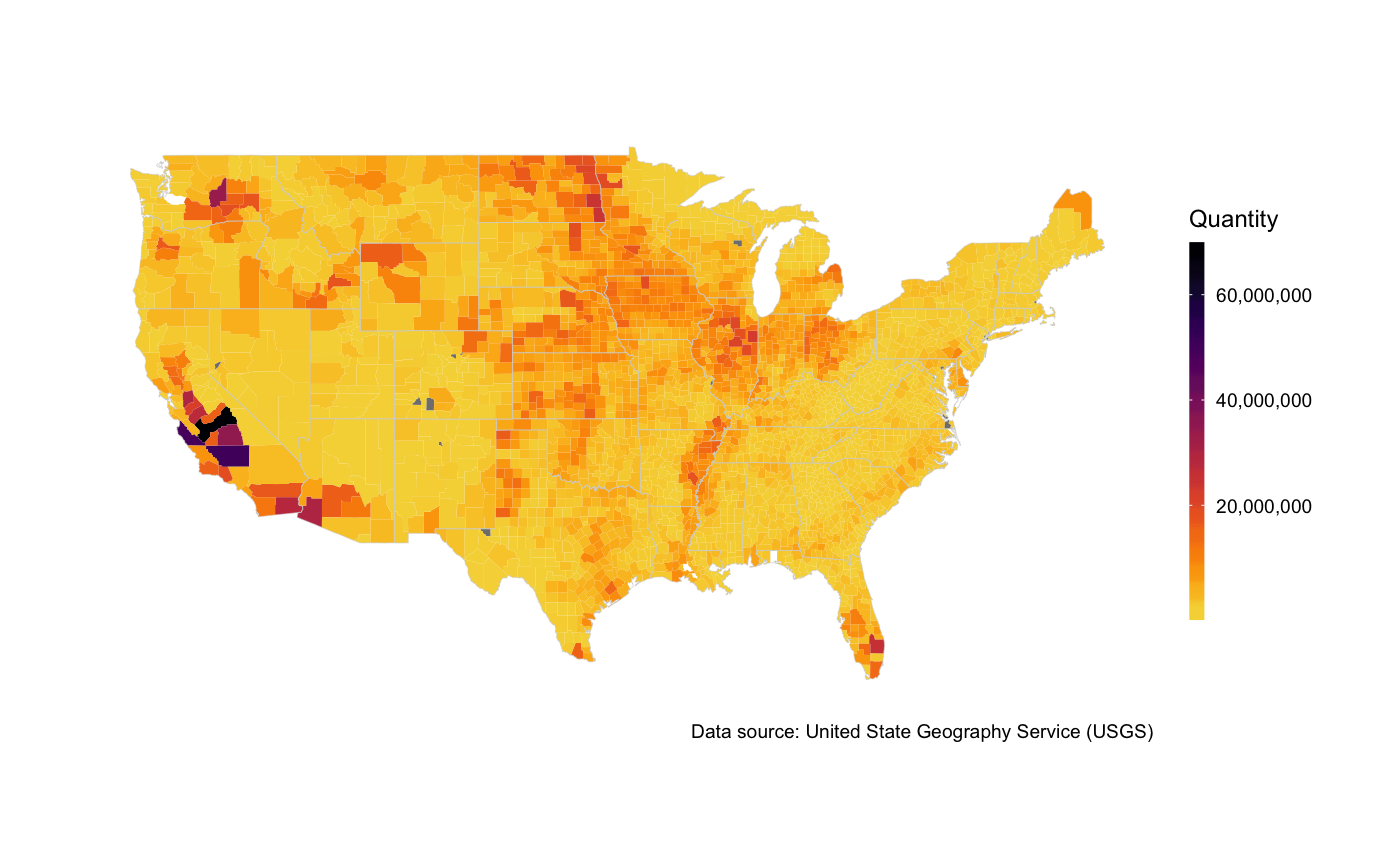
As the maps are actually ggplot2 objects, all the common API for ggplot2 can be used here. We can also add a title for the map to make it more informative.
us_plot +
  ggtitle(paste(Nutrient,  " from ", Input_Type, " input to ", Farm_Type, " in the year of ",Year,
                     " at ", level, " level",sep = ""))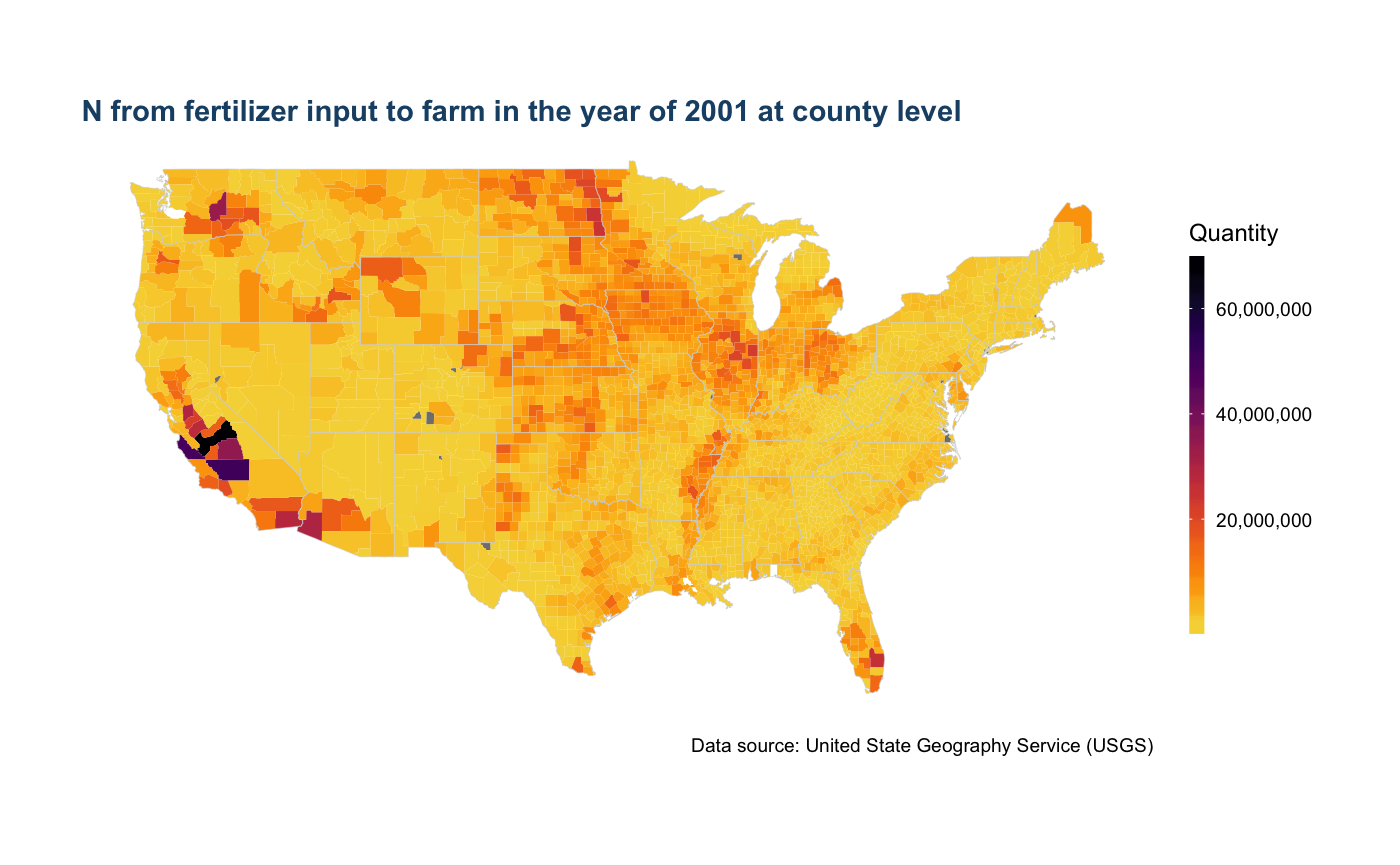
For more details about mapping fertilizer data, please see this vignettes
Comments and Questions
If you have any problems or questions, feel free to open an issue here.