Recently, many researchers employ R to conduct data cleaning, manipulation and visualization. Among all the R packages, ggplot2 is one of the most popular, fancy and powerful tool to visualize data. Although ggplot2 is very convenient and easy to use, it is difficult to plot data in dual y-axis. According to the comments from Hadely Wichham on June 23, 2010, the main developer of ggplot2, the authors of ggplot2 hold the idea that:
It’s not possible in ggplot2 because I believe plots with separate y scales (not y-scales that are transformations of each other) are fundamentally flawed. Some problems:
- The[y] are not invertible: given a point on the plot space, you can not uniquely map it back to a point in the data space.
- They are relatively hard to read correctly compared to other options. See A Study on Dual-Scale Data Charts by Petra Isenberg, Anastasia Bezerianos, Pierre Dragicevic, and Jean-Daniel Fekete for details.
- They are easily manipulated to mislead: there is no unique way to specify the relative scales of the axes, leaving them open to manipulation. Two examples from the Junkcharts blog: one, two.
- They are arbitrary: why have only 2 scales, not 3, 4 or ten?
Even though there exist some concerns regarding dual y-axis plot, it is very convenient for hydrologist and environmental engineers, who focus on stream nutrient dynamics, to plot both hydrograph and chemograph in the same graph. To make the dual y-axis graph, we can use a built-in ggplot2 function, sec_axis() updated in Nov. 2016, to add second y axis.
A reproducible example to show hydrograph and chemograph in dual y-axis
The sec_axis() function is actually the projection the original y axis to a secondary axis. The tricky is to define a proper transformation function. We can use the ratio of maximum solute concentration over maximum stream discharge to transform the y axis. There is an example using the stream discharge and turbidity data from USGS.
# import libraries
require(dataRetrieval)
require(ggplot2)
require(dplyr)

# information for usgs stations.
station_Id = "05446500" #Rock River Near Joslin, IL
parameter_code = c("00060", "63680")  # discharge, Turbidity (Form Neph).
start_date = "2017-06-01"
end_date = "2017-08-01"

# retrieve data from usgs.
turbidity_flow = readNWISuv(siteNumbers = station_Id,
                            parameterCd = parameter_code,
                            startDate = start_date,
                            endDate = end_date)
# data cleaning.
turbidity_flow = renameNWISColumns(turbidity_flow)
param_info = attr(turbidity_flow, "variableInfo")
site_info = attr(turbidity_flow, "siteInfo")

# the ratio of maximum solute concentration over maximum flow.
trans_ratio = max(turbidity_flow$.HACH._Turb_Inst, na.rm = TRUE) /
  max(turbidity_flow$Flow_Inst, na.rm = TRUE)

# plot data
ts = ggplot(turbidity_flow, aes(x = dateTime))+
  geom_point(aes(y = Flow_Inst, color = "Stream discharge"))+
  geom_line(aes(y = Flow_Inst, color = "Stream discharge"))+
  geom_point(aes(y = .HACH._Turb_Inst/trans_ratio, color = "Turbidity"))+
  geom_line(aes(y = .HACH._Turb_Inst/trans_ratio, color = "Turbidity"))+
  scale_y_continuous(name = param_info$variableDescription[1],
                     sec.axis = sec_axis(~.*trans_ratio, name = "Turbidity, Form Neph, HACH"))+
  ggtitle(site_info$station_nm)+
  labs(color = "Parameters")+
  theme(legend.position =  c(0.15, 0.85))

ts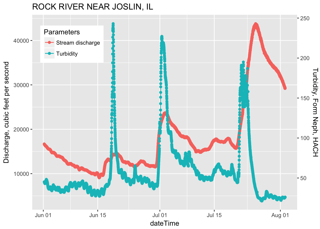
Further materials
The example in this blog only considers 1:1 transformation between two Axis. Sometime there are complicated conditions where the transformation formula needs more attentions. Please visit the following sites for more information:
References:
Some of the information in this blog was adapted from Markus Loew, DataRetrieval tutorial, Hadley’s comments and Official website of sec_axis()